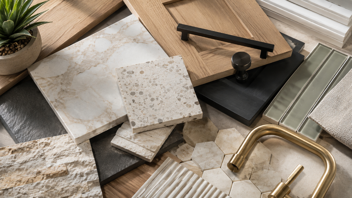
Start with how you live in the room, not a picture you saved
Before any tile or fixture, we ask one question: what actually happens in this bathroom? Two people getting ready at the same time on a weekday is a different room than a quiet guest bath. Someone who takes a long soak to unwind needs something different from someone who has not filled a tub in five years. The homeowners happiest with their remodel designed around their real routine first, then chose the elements that supported it.
Which ideas are worth the money? A quick guide
| Element | What it solves | Right for you if… | Where it lands on cost |
|---|
| Curbless / walk-in shower | Daily use, open feel, future access | You use a shower daily and plan to stay in the home | Higher, usually worth it |
| Freestanding tub | A relaxing soak and a focal point | Someone in the house actually takes baths | Mid to higher; skip if nobody soaks |
| Double vanity | Two people, one weekday morning | Your mornings overlap and the wall can carry it | Mid; one bigger sink is often better when space is tight |
| Floating vanity | Makes a small room read larger | You want the open look and the wall can be built for it | Mid; slightly less storage |
| Large-format tile | Fewer grout lines, less upkeep | You want low maintenance on walls and floors | Mid; a strong default |
| Layered lighting | Even light at the mirror, mood at night | Always. The upgrade people regret skipping | Lower relative to impact |
Our rule of thumb, not a quote. For real Phoenix pricing, see the cost page linked below.
Vanities: which style fits how you get ready?
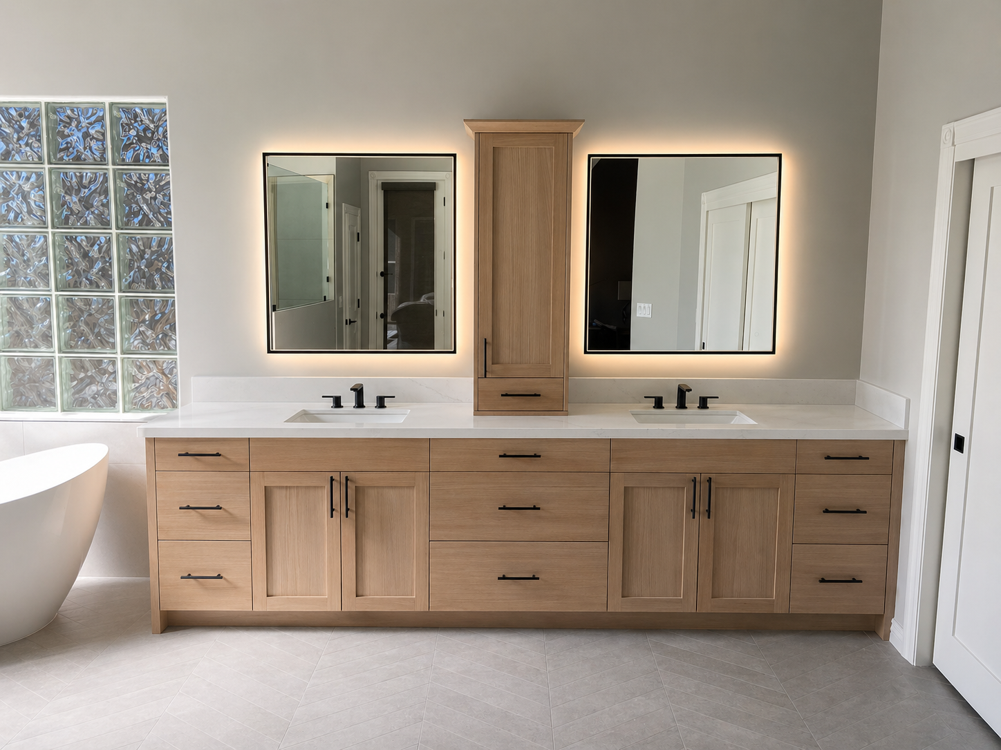
The vanity is the piece you stand at every morning, so it earns its money more than almost anything else in the room. Two sinks solve one real problem: two people crowding one space on a weekday. If that is your morning, a double vanity is one of the best places to spend. If it is not, you are often better off with one generous sink and far more counter and storage. A wall-mounted floating vanity makes the floor read continuous and helps a smaller bathroom feel larger, at the cost of a little storage and a wall built to carry the weight. And an antique dresser converted into a vanity gives you a piece nothing else in the neighborhood has, as long as you treat it as the custom, water-sealed work it is.
Fixtures: statement piece, or future maintenance call?
A vessel sink that sits on top of the counter is a striking look with real trade-offs: the faucet has to reach it, the height does not suit every user, and the rim is one more edge to keep clean. An undermount sink is quieter to look at and easier to wipe down. Waterfall faucets feel calm and modern; just know the open spout can splash depending on the sink, and finishes vary in how they wear. Pick the sculptural option when the look is the point for you, and skip it when a clean, low-fuss counter is what you actually want.
Do you actually need a freestanding tub?
This is the element people most often want and most often use the least. A freestanding tub is a beautiful centerpiece, and it asks for floor space, a filler that reaches it, and a body that enjoys a long soak. If you are a bath person, size it to fit the person who will use it; a shorter user is more comfortable in a shorter tub, not a longer one. If nobody in the house has taken a bath in years, that same square footage almost always does more as a bigger, better shower. Be honest about which one you are, and let that decide.
Showers: the upgrade most people underrate
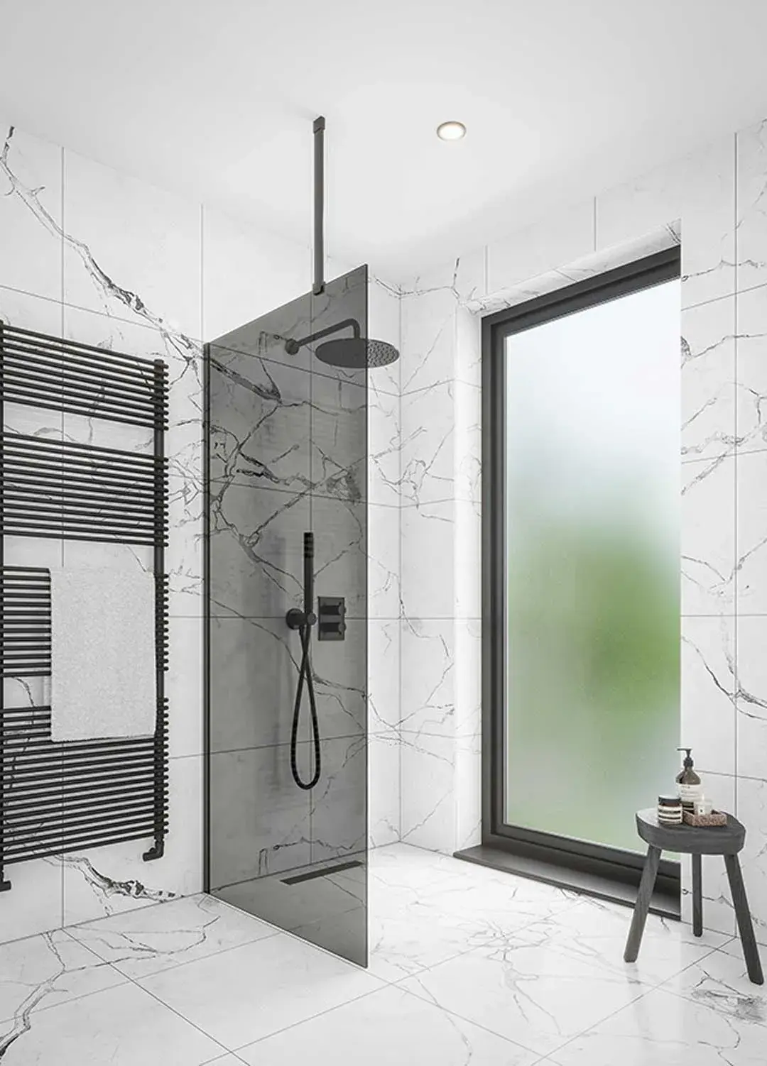
If we could point you at one place to spend, it is often the shower, because you use it every day. A roomy walk-in makes the whole bathroom feel more open, and it is where features change your morning: a rainfall head, a handheld on a slide bar, a bench, a niche at the right height so bottles are not on the floor.
The move most people underrate is the curbless, or zero-threshold, shower, where the floor runs straight in with no lip to step over. It looks seamless, and it quietly future-proofs the room, since you can walk or roll into it for years to come. It takes real planning, because the floor has to be pitched and waterproofed correctly, which is the kind of detail a design-build team should own. For anyone thinking about aging in place, the National Kitchen & Bath Association publishes accessible-clearance bathroom planning guidelines worth reading.
Same footprint, re-planned
The Tempe primary bath. The fix was not a new fixture. It was a new floor plan inside the same four walls.
Before
Two cramped zones with dead space between them: a small hard tub, a stained tight shower, two narrow closets, and no door at the entry.
Zone · wasted band · zone
After
A doorless walk-in shower with two zones and a full-width bench, two closets combined into one walk-in, the tub moved to the best light with a chandelier, and a pocket door at the entry.
Walk-in shower · walk-in closet · tub in the light
Schematic, not to scale. The room later won NARI Contractor of the Year.
Tile and lighting: where each choice earns its place
Large-format tile has fewer grout lines, which reads clean and means less to keep up with, so it is a strong default for walls and floors. Save mosaic and patterned tile for an accent, a shower floor, one wall, or a niche, because a little goes a long way. On lighting, layer it. Put sconces beside the mirror, not just a fixture above it, so your face is lit evenly instead of shadowed from overhead, and add a dimmer so the room can be bright at 7 a.m. and calm at 10 p.m. A chandelier or an LED backlit mirror is a lovely finishing touch, but it is the accent, not the plan. Get the layered basics right first.
A real Phoenix-area bathroom that pulled it together
Rich and Julie had a primary bathroom that was quietly wearing on them. The tub was small, hard cultured marble, the kind you get into once and decide not to again. The shower beside it was tight, its glass door stained enough over the years that they had hung a curtain to cover what they had given up cleaning. There was no door at the entrance, so the early riser could not get ready without waking the other. Two narrow closets sat across the room, with a band of floor between the zones doing no work at all.
None of it was an emergency. Together it was the slow kind of friction that tells a couple they have outgrown their house. They had not outgrown the house. They had outgrown the bathroom, and their fix-it list was the usual one: replace the tub, maybe clean the shower glass, maybe a new vanity. Lorrie read the room differently. The tub was not going unused because it was the wrong tub. The room was built around two cramped zones with dead space between them, so nicer fixtures inside the same layout would have been like buying better chairs for a dining room nobody wants to sit in. The fix was a new floor plan, and you can see it in the before-and-after above. The room later won NARI Contractor of the Year. You can see the full project in our Tempe walk-in shower case study.
So which elements are actually worth the money?
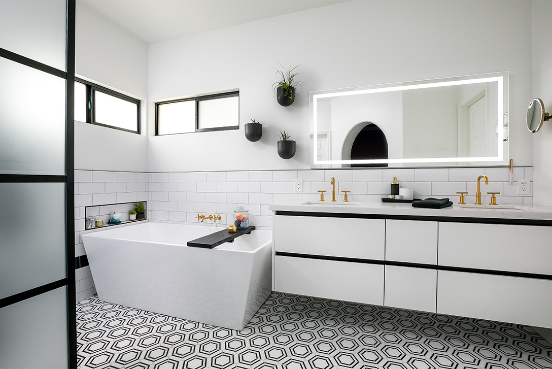
If you make us rank it, here is the order we stand behind. Spend first on the things you touch every day and cannot easily change later: the shower, the vanity, and the lighting. Spend next on the elements that solve a real problem for your household, like a curbless entry or a second sink. Treat the showpieces, a freestanding tub, a chandelier, a dramatic feature wall, as the finishing move, worth it when they fit how you live and skippable when they are only there for the photo. For the other side of that coin, here are the bathroom remodel mistakes we see most often in Phoenix.

 Lorrie
 Lorrie
 Scott Hochuli